A QR code with your logo in the middle looks more trustworthy, gets scanned more, and — done wrong — fails silently at the worst moment: on a printed menu, a poster, or product packaging that already shipped. The good news is that "done right" is not guesswork. QR codes were designed from day one to survive damage, and a logo is just deliberate, well-placed damage. Here's how the budget works.
Why a covered QR code still scans
Every QR code carries Reed–Solomon error correction — redundant data spread across the pattern that lets a reader reconstruct missing squares. When a code is generated, one of four correction levels is baked in:
| Level | Damage it can recover | Typical use |
|---|---|---|
| L (Low) | ≈ 7% | Clean digital display, maximum data density |
| M (Medium) | ≈ 15% | General purpose default |
| Q (Quartile) | ≈ 25% | Print in rough conditions |
| H (High) | ≈ 30% | Logo codes — always use this |
Our QR Code Generator always encodes at level H when you add a logo. That gives the code a 30% damage budget; the logo spends part of it, and the rest stays in reserve for real-world abuse — glare, folds, scratches, low light, cheap printing.
The logo size rule
The mistake is thinking "30% correction = 30% logo". The correction budget has to cover everything that goes wrong, not just the logo. Our rule after testing codes across phone cameras old and new:
Centred matters because the three big corner squares (finder patterns) and the smaller alignment square are not protected by error correction — a logo that drifts into a corner kills the code instantly, no matter how small it is.
Contrast: the #1 reason codes fail
- Dark pattern on light background. Readers look for this; the reverse (a light pattern on dark) fails on many older phones.
- Avoid pale foregrounds. Light grey, yellow or pastel modules scan poorly in dim light. If you brand with colour, keep it dark — navy, deep purple, dark green all work.
- Gradients are fine if both ends stay dark. A gradient running from dark blue to black scans; dark blue to light cyan is a coin flip.
- Leave the quiet zone alone. The empty margin around the code (4 modules wide) is part of the spec — don't crop it or print text inside it.
Print size: the distance ÷ 10 rule
A perfect code printed too small still fails. The working rule: minimum printed width ≈ scanning distance ÷ 10.
| Where it's used | Scan distance | Minimum width |
|---|---|---|
| Business card, menu | 25 cm | 2.5 cm |
| Flyer, packaging | 50 cm | 5 cm |
| Shop window | 1.5 m | 15 cm |
| Poster / banner | 3 m | 30 cm |
For anything printed, export SVG rather than PNG — vector stays razor sharp at any size, while an upscaled PNG grows soft edges that eat into the error budget.
Step by step
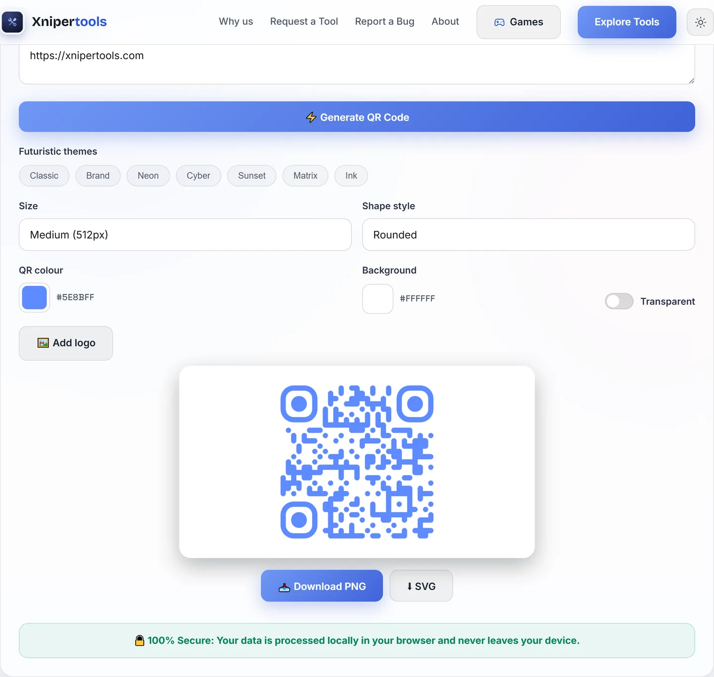
- Paste your link. Shorter URLs make simpler, more forgiving patterns — xnipertools.com/qr beats a 200-character tracking URL.
- Pick a theme or set your own colours — keep the foreground dark (see contrast rules above).
- Upload the logo. A square logo with some padding works best; the tool centres it automatically.
- Download PNG for screens, SVG for anything printed.
- Test before you print: scan from your phone at arm's length, in poor light, and from an angle. Ten seconds of testing saves a reprint.
Static vs dynamic — why these codes never expire
Paid QR services often generate dynamic codes: the pattern points to their redirect server, which forwards to your link. That enables scan statistics — and means your code dies the day the subscription lapses or the service shuts down. The codes from our generator are static: the URL is encoded directly in the pattern itself. They work forever, offline, with no third party in the loop. The trade-off is that the destination can't be changed after printing — so double-check the link before you send anything to press.